I review plenty of Chinese smartphones, from brands like Xiaomi, Realme, Vivo, Oppo and more, and a common complaint I level at them is bloatware, or pre-installed apps.
You turn on your brand-new smartphone, and the home screen is chock-full of different functions, tools, and apps, sometimes even third-party ones, and you're left wondering "wait, is this a second-hand phone?". The lack of bloatware is one reason so many people love stock Android.
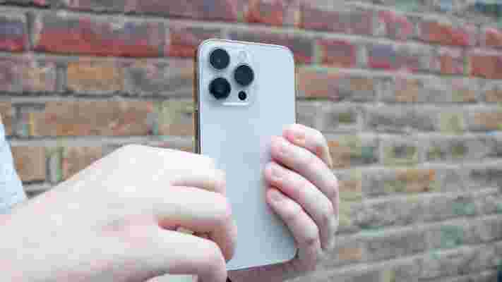
I don't review iPhones, and I haven't owned one since a second-hand iPhone 6 I inherited from my mum about a hundred years ago. I just got an iPhone 13 Pro though, to do a camera comparison with the Samsung Galaxy S22 Ultra , and saw something I totally didn't expect: a horrible amount of bloatware.
iOh-no-S
I haven't installed a single app on this iPhone, and the home screen is already cluttered with loads of stuff.
The first page is super busy with stuff like FaceTime, Apple TV, Maps, Health, News, Podcasts, Wallet, Reminders, and the apps even spill onto a second home page with Books, Translate, Stocks, Tips, whatever Shortcuts is, Home, Find My, iTunes Store, and a folder with even more apps in it.
Why would Apple think that, if I was interested in stocks, I wouldn't be able to download an app for it? That I need them to pre-install it for me?
Loads of these pre-installed apps make the bold assumption that I'm already deep into the Apple ecosystem. Things like Apple TV, Home and Watch all assume I've already given the company plenty of my money.
Apple really needs to take a leaf out of Google's book by combining these apps too. Why can't TV, Podcasts, iTunes Store and Books all be combined into one, like how Google Play covers most of these functions? Having them as separate apps just results in a cluttered screen.
iOS' messy-looking user interface design doesn't exactly help with the appearance of its home screen, but there really are too many pre-installed apps here.
Are people okay with this?
The iPhone might have the worst bloatware experience I've had from any phone I've tested.
I know not everyone will agree with this - some people think that Apple can do no wrong, that everything they do is holy. But while my exclamation upon booting up the iPhone 13 Pro started with 'Holy...' it finished quite differently.
But why don't people call out Apple for its bloatware? Many people criticize Chinese phones for their pre-installed apps, but most I've tested have fewer pre-installed ones than this, and even those brands aren't cheeky enough to try and sell you more devices like Watch or Home does.
Stock Android feels like a clean meadow in comparison. Even though Google has quite a few apps, they're all hidden in one folder on the home screen, and Google doesn't pre-install all its apps either.
Knowing what iPhone users are okay with, I'm certainly going to be more lenient on Chinese manufacturers and their pre-installed apps going forward. And if you're an iPhone user who assumes that this mess of pre-installed apps is the norm for smartphones: pick up an Android, you'll be pleasantly surprised.
Apple Watch SE 2: here's everything we know so far
When will an Apple Watch SE 2 be released? Leaks are few and far between for a new affordable smartwatch, but that doesn't mean it won't arrive alongside the Apple Watch 8 and iPhone 14 in 2022.
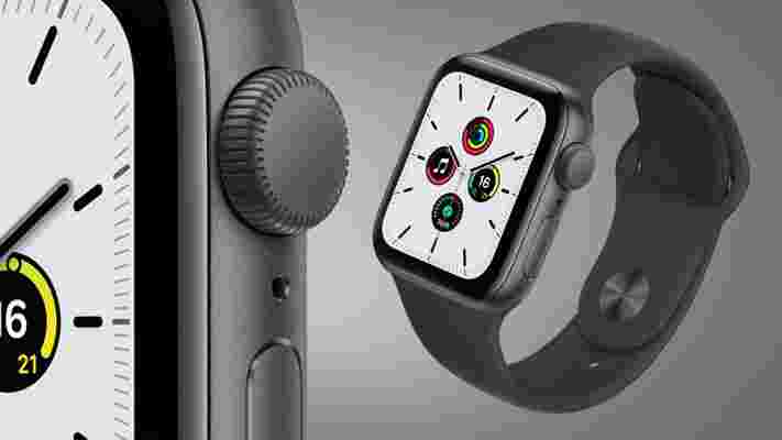
We first saw the Apple Watch SE in 2020, and it was something of a surprise, as an affordable counterpart to the Apple Watch 6 in the spirit (and naming convention) of the iPhone SE (2020) .
It's something of an updated version of the Apple Watch 3 with the same health tracking capabilities but a newer chipset that should make it compatible with new watchOS versions for years to come.
Likewise, we expect the Apple Watch SE 2 to be a more affordable wearable with enough of the recent bells and whistles (like, hopefully, the always-on display) from recent flagship watches, but we haven't heard specifics on what it will include.
Below we’ve included some predictions as to when it might launch and what it might cost, along with a list of the improvements we want from it. And as rumors start to roll in we’ll be including all of those in this article too, so check back often to stay up to date on the Apple Watch SE 2.
Apple Watch SE 2: cut to the chase
Apple Watch SE 2 release date and price
So far it looks like the Apple Watch SE 2 might land in September, with leaker and journalist Mark Gurman claiming it will land in the 'fall' (with a September launch alongside the iPhone 14 being the most likely timing in that case). Prior to this leak, reputable analyst Ming-Chi Kuo claimed it will arrive sometime in 2022 .
Then again, since Apple has only launched one Apple Watch SE model so far, there’s not much to go on, so there’s a chance the Apple Watch SE 2 won’t even land ever.
There aren’t any price rumors yet either, but the original Apple Watch SE starts at $279 / £260 / AU$429, with prices rising for LTE, a larger size, or different strap types. There’s a fair chance that the Apple Watch SE 2 will have a similar starting price, but we can’t be sure for now.
News and leaks
Tim Cook has spoken about the future of the Apple Watch on the Outside podcast, saying that “there’s a ton of innovation left to go in there” and "We are in the early innings… think about the amount of sensors in your car. And arguably, your body is much more important than your car.”
That suggests a continued focus on health and fitness for future Apple Watch models, and we’d expect the Apple Watch SE 2 would be included in that.
Elsewhere, a leak suggests that the Apple Watch SE 2 might have “major updates to activity tracking” along with a faster chipset. Though the source was talking about it in the same breath as the Apple Watch 8, so it's possible some of those things will only come to the pricier model.
The biggest leak so far around the smartwatch says the design will remain largely unchanged from last time, a faster processor will be included inside (perhaps the S7 from the Apple Watch 7), and the price will get a slight increase.
What we want to see
There are some key improvements that we want from the Apple Watch SE 2, including the following.
1. An always-on display
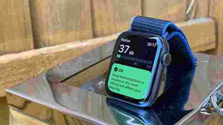
The Apple Watch SE doesn’t have an always-on display, which is one of the main things it lacks in comparison to the Apple Watch 6.
That’s fair enough, as Apple would have wanted to save some features for its more premium wearable, but by late 2021 when the Apple Watch SE 2 will hopefully land, we’d like the always-on display to be a standard feature across the range.
2. A longer-lasting battery
The Apple Watch SE actually has better battery life than most Apple Watch models, but at around a day and a half it still doesn’t match a lot of other wearables, and also doesn’t really cut it for sleep tracking, since you’ll likely find you want to charge it at night.
So for the Apple Watch SE 2 we’d like to see life extended to at least two days, and ideally three or more.
3. A bottom of the range price
While the Apple Watch SE is positioned as a relatively budget option in the Apple Watch range, it’s actually not the cheapest wearable that Apple sells. That’s the Apple Watch 3 , which is still on sale.
To simplify things, we’d like to see the Apple Watch SE 2 have the lowest price of any currently available Apple Watch, so it’s clear what the wearable’s position is in the range.
4. A wider range of colors
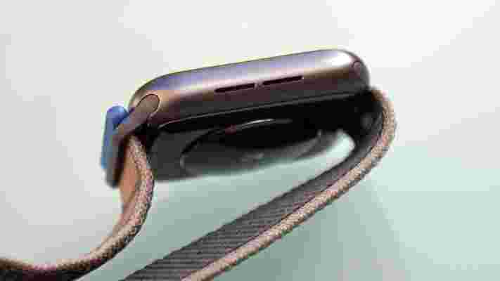
The Apple Watch SE is only available in gold, silver, and space gray shades, and while there’s nothing wrong with those colors, we’d like to see a wider selection available for the Apple Watch SE 2, including perhaps something flashier, like the red color that you can get the Apple Watch 6 in.
You can of course get a lot more color from the strap, as we’re only talking about the body here, but we’d still like more options.
5. Blood oxygen monitoring
Beyond the always-on display, one other feature the Apple Watch SE lacks that the Apple Watch 6 has is blood oxygen monitoring.
This is a useful health monitoring feature, but probably not a big selling point for most people, so while we’d like to see it, we wouldn’t mind too much if Apple keeps this for premium models.
OnePlus 10 Pro vs iPhone 13 Pro: two smartphones in the Pro league
The OnePlus 10 Pro is one of the first big flagship phone launches of 2022, which means that it runs smack bang into the star of late 2021, the iPhone 13 Pro .
We’re going to have to wait just a little longer for a global rollout for the OnePlus 10 Pro, but we already know every spec, measurement, and shiny design choice that OnePlus has implemented.
While we reserve our full judgment for another time, here’s how the OnePlus 10 Pro is shaping up against the most high-profile premium flagship around.
OnePlus 10 Pro vs iPhone 13 Pro: price and availability
The OnePlus 10 Pro was unveiled to the world on Jan. 11, 2022, with availability in China on January 13. We’re anxiously awaiting news of a global rollout as we speak.
This means that all we have is Chinese pricing, which starts from 4,699 Chinese Yuan for 8GB RAM and 128GB internal storage. That works out to around $740 / £550 / AU$1,056. Alternatively, you can pay 4,999 Chinese Yuan ($786 / £586 / AU$1,123) for 8GB/256GB, or 5,299 Chinese Yuan ($833 / £621 / AU$1,191) for 12GB RAM and 256GB.
The iPhone 13 Pro arrived on Sept. 24, 2021. Prices start from $999 / £949 / AU$1,699 for the entry-level 128GB model of the iPhone 13 Pro, while the 256GB model costs $1,099 / £1,049 / AU$1,869, and the 512GB model costs $1,299 / £1,249 / AU$2,219.
You also have the option of a new 1TB model, which costs $1,499 / £1,449 / AU$2,569.
Design
The OnePlus 10 Pro is quite a bit bigger than the iPhone 13 Pro in every way, measuring 163 x 73.9 x 8.6mm. The iPhone 13 Pro measures 146.7 x 71.5 x 7.65mm.
Despite this size difference, the iPhone 13 Pro is actually a little heavier than its rival. We’re only talking 204g as opposed to 200.5g, but it shows how dense the iPhone 13 Pro is.
You can likely put that down to the iPhone 13 Pro’s more premium materials, specifically the use of a stainless steel rim. The OnePlus 10 Pro, like most Android flagships, utilizes lighter (and cheaper) aluminum.
Apple coats the flat display of its phone with a so-called Ceramic Shield, which is believed to be quite a bit tougher than the Gorilla Glass Victus covering on the OnePlus 10 Pro. Both phones have achieved an IP68 rating, so are similarly water- and dust-resistant.
Those are the facts and figures, but there’s an obvious aesthetic difference between these two phones. Apple has gone the flat-edged, sharp-cornered route, while the OnePlus 10 Pro is more curvaceous and familiar.
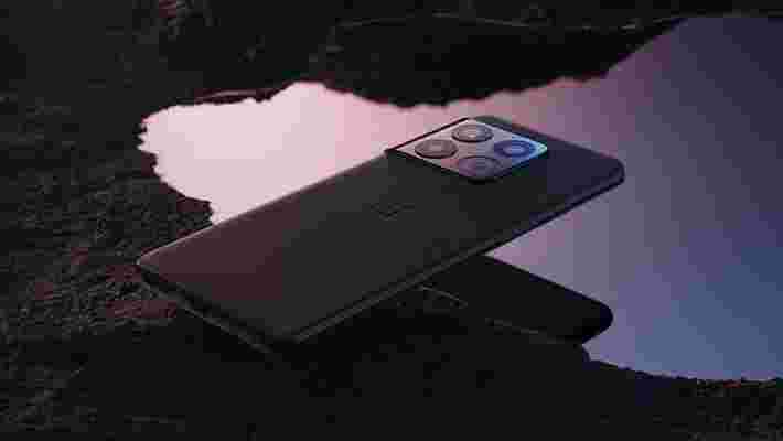
That said, the OnePlus camera module is certainly something to behold. The company adopted a new fold-around design that appears to emerge from the frame, and it’s striking. Apple’s rounded-square blister, by contrast, looks a little stuck-on.
There’s also a noticeable difference around front, where Apple still employs a Face ID notch, and OnePlus goes with a more subtle hole-punch notch. The OnePlus method looks better, but Apple’s secure facial recognition system continues to shine.
Display
The OnePlus 10 Pro has a 6.7-inch display, which means that it’s much larger than the iPhone 13 Pro’s 6.1-inch screen.
Both use OLED panels, so they’re similarly punchy and contrasty. Both also get to 120Hz, so they’re nice and smooth.
On the latter front, however, the OnePlus 10 Pro can dip as low as 1Hz thanks to its use of second-generation LTPO2 technology, while the iPhone 13 Pro can only dip to 10Hz. OnePlus wins on the efficiency front.

OnePlus wins on sharpness, too, with a 3216 x 1440 (QHD+) resolution comparing favorably to the iPhone 13 Pro’s 2532 x 1170 equivalent. Given the size difference, however, the pixel density isn’t drastically different.
The OnePlus phone can hit a peak brightness of 1,300 nits, which is slightly higher than the iPhone 13 Pro’s 1,200 nits.
We’d have to give the edge to the OnePlus 10 Pro on paper, but of course we won’t know which is better until we’ve gone hands-on with the phone. We know that the iPhone 13 Pro’s screen is awesome to look at and use in all scenarios, so it’s a high bar to reach.
Camera
We have to couch these pre-review versus pieces in a whole bunch of caveats, for obvious reasons. You can’t tell for sure how a particular smartphone component is going to stack up until you’ve tested it.
But given those caveats, we’re about as certain as it’s possible to be that the iPhone 13 Pro’s camera will be better than the OnePlus 10 Pro’s overall.
How can we say that? It’s simple really. The iPhone 13 Pro is the best camera phone on the market. It’s also quite a bit better than the OnePlus 9 Pro, and the OnePlus 10 Pro doesn’t appear to be a huge leap forward from its predecessor in terms of camera hardware.
Early reports seem to confirm that you’re essentially getting the same triple-camera system as before. That means the exact same 48MP f/1.8 wide sensor, the same 50MP f/2.2 ultra-wide, and the same 8MP f/2.4 telephoto for 3.3x zoomed shots.
The only real hardware difference here, other than a wider ultra-wide lens, is the provision of a new faster processor, which should bring the usual advances in image processing and AI scene selection. We have high hopes that the Night mode will be much improved, in particular.
Once again, OnePlus teamed up with Hasselblad for the Nordic camera brand’s distinctive color tuning and classy camera UI. We’re interested to see how this relationship has developed for the second generation.
However, it’s hardly likely to be a seismic shift for the OnePlus 10 Pro camera.
None of which is a bad thing. The OnePlus 9 Pro camera was a massive step up for the brand. We liked it a lot.
But the iPhone 13 Pro is likely to remain on another level. Unlike OnePlus, Apple stepped up on the hardware front when compared to its predecessor.
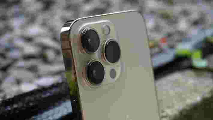
It’s another triple 12MP system, but this time you get the sensor shift stabilization system of the iPhone 12 Pro Max, adding an uncanny level of stability for those low-light shots. You also get a new larger wide sensor with a wider f/1.5 aperture, and an improved ultra-wide with a wider f/1.8 aperture. That ultra-wide can also take sharp macro shots this time.
On the telephoto front, Apple added a new 3x zoom camera. It’s now possible to shoot Night mode shots using the telephoto sensor as well – though OnePlus has also added this facility with the OnePlus 10 Pro.
We’re not counting the OnePlus 10 Pro camera out, by any means. But it’s going to have to really pull off an algorithmic coup if it’s to dethrone the iPhone 13 Pro, because there’s nothing notably new from a hardware perspective.
Specs and performance
The OnePlus 10 Pro features Qualcomm’s new Snapdragon 8 Gen 1 processor. We need to spend some time putting this chip through its paces, but even the official verdict is that it represents a mere 20% boost over the Snapdragon 888 that powered the OnePlus 9 Pro.
By contrast, the iPhone 13 Pro’s A15 Bionic chip is said to be around 50% faster than the Android competition, i the Snapdragon 888. You do the math.
This is all largely meaningless in the real world, of course. The iPhone 13 Pro feels beautifully fast and fluid, and the OnePlus 10 Pro is almost certain to feel the same.
The OnePlus 10 Pro runs on 8GB of RAM as standard, and there’s also a 12GB option out there. When it comes to storage, you get 128GB and 256GB options. Apple gives you a 512Gb and a 1TB option on top of those two tiers.
On the software front, we’re expecting the OnePlus 10 Pro to come with the latest version of the company’s own custom OS, known as OxygenOS. The Chinese model, however, uses Oppo’s ColorOS, which is much less appealing if just as fully featured (and arguably more customizable).
Either way, there’ll be a ColorOS core to the OnePlus 10 Pro, as the two companies have merged their efforts since last year’s OnePlus 9 Pro. We’ll have to see how this affects what has been one of our favorite Android UIs. Fingers crossed that the changes are minimal.
There are no such doubts surrounding Apple’s iOS, of course. The company’s tight hold on the software experience makes for a blissfully consistent and smooth experience, if a less customizable and more boxed-in one.
Battery
OnePlus upped the capacity of the OnePlus 10 Pro’s battery to 5,000 mAh, which is bigger than the OnePlus 9 Pro’s, but fairly standard for a modern Android flagship.
This is much bigger than the iPhone 13 Pro’s 3,095 mAh cell, but don’t let that fool you. Apple’s phones tend to be more efficient than Android phones, through a combination of software differences and hardware optimization.
To that end, we’re expecting battery performance to be fairly similar between these two phones. That is, that both phones will be capable of lasting a full day of fairly intensive usage without needing to recharge.
That’s certainly the case with the iPhone 13 Pro. It wasn’t quite the case with the OnePlus 9 Pro, but that aforementioned capacity increase, added to a more efficient processor, should enable it to close the gap.
One way in which the OnePlus 10 Pro will definitely beat the iPhone is with its charging times. With a 80W charger provided in the box, it puts the iPhone 13 Pro’s 23W support to shame. Even more so when you realize that Apple asks you to supply your own charger.
It’s a similar lead in the wireless charging stakes, where the OnePlus 10 Pro supports 50W, and the iPhone 13 Pro supports 7.5W. You can double that if you buy a MagSafe charger, which is Apple’s magnetic peripheral system.
Takeaway
The OnePlus 10 Pro is looking like a fairly minor update to the OnePlus 9 Pro on paper. Given that the OnePlus 9 Pro was one of our favorite phones of early 2021, that’s not necessarily a bad thing.
But it faces a much stronger field than its predecessor. The iPhone 13 Pro supplied a competitive display, improved stamina, and the best camera system in the business when it landed in late 2021. Apple finally made a phone worthy of the ‘Pro’ moniker, thus putting every other ‘Pro’ phone on notice.
Do we think that OnePlus has what it takes to beat Apple in the premium phone stakes? Based solely on the trajectory of its last few signature phones, most definitely.
However, there are doubts surrounding the once-strong OnePlus identity following its merger with Oppo. It all means that this particular comparison remains a tantalizingly open question.