We’ve been big fans of the Micro Four-Thirds system since the original Olympus PEN E-P1 launched way back in 2009. It set the trend for mirrorless interchangeable lens cameras, all of which try to provide the flexibility and image quality of a digital SLR in a smaller and lighter package. Panasonic quickly followed with its own Micro Four-Thirds models, the most recent being the Panasonic Lumix DMC-G3 , and both Sony and Samsung responded with their own equivalent formats.

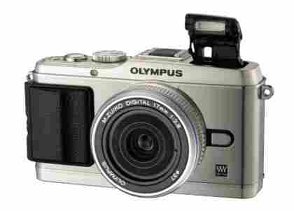
The flagship E-P3 - also available in white and black - with its new pop-up flash
Olympus went on to launch the lower-priced PEN Lite E-PL1 , and then E-P2 and E-PL2 models - but all of those cameras shared the same core specifications and sensor. So we were very excited yesterday to see the completely overhauled new PEN range - comprising of the top-end PEN E-P3, the mid-range PEN Lite E-PL3, plus an entirely new line - PEN Mini - represented by the E-PM1. We got to play with pre-production models of the first two cameras, but the smaller E-PM1 was only shown in a mock-up form.
THE PEN IS MIGHTY THAN …
The first thing that strikes you about the E-P3, is just how similar it looks to its predecessors. The key physical change is the mode selection dial, which has moved from a recessed position on the left, to a raised one on the right. We rather liked the old recessed dial, but it's not a huge faff changing modes with the other thumb. Moving the dial has allowed Olympus to fit in a small pop-up flash on the left hand side. This is hidden under a hatch when not in use, and so doesn't spoil the smooth lines of the camera.
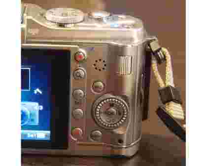
On the rear of the E-P3, the button layout looks largely unchanged, though a dedicated video button has been added at the top. The display has been overhauled with a gorgeous high-detail 3.0in OLED screen, which provides far deeper blacks more vibrant colours, and better viewing angles than any LCD. The screen shape has changed too, again with video in mind, with a more widescreen aspect ratio than before - more on this later. For photography this is a shame, leaving black bars on either side of your 4:3 images.

The control layout has altered slightly, note the new video button at the top
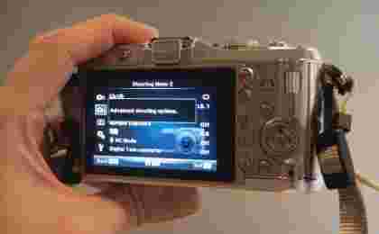
This new display is also a touchscreen, an odd addition to what we thought of as being the 'photography purists' model in the PEN range. Still you don't have to use it if you don't want to. It's a useful extra, with options for spot focus, and even shutter release by tapping the screen - you can disable both of these if you prefer. Bizarrely, the menu hasn't been redesigned for the touchscreen display (we guess to keep it consistent across the range). In fact the menu itself is essentially unchanged from previous models, except for some slicker graphics and jazzy colours.

Despite the touchscreen, the menu system has barely changed
The only other external innovation is the removable hand grip. A standard textured grip comes with the camera, but this can be unscrewed and switched for a larger (but, bizarrely, smoother) grip. Alternatively you can use the camera without the grip at all for a super-minimalist appearance. Personally we wished that a far larger and sturdier grip was also available, but the mounting screw might not take such a design.
Turn to page 2 for details of the Lite and Mini models ...