The camera phone wars may still be fierce, but an equally ferocious battle is brewing at the other end of the photographic spectrum – with the new Nikon Z 400mm f/2.8 TC VR S recently riding in on the back of the Nikon Z9 to battle Canon’s pro mirrorless cavalry.
The Nikon Z 400mm f/2.8 is very much a professional lens, as you can tell from the $13,999 / £13,499 / AU$22,999 price tag, but its specs (along with some new sample photos) suggest it could very much be the mirrorless wildlife lens to beat.
While Canon's RF 400mm f/2.8L IS USM is pretty much a direct copy of the camera giant's equivalent DSLR lens, including the same optical formula, Nikon's new super-telephoto prime has been designed from the bottom up for mirrorless cameras, which brings a few innovative features.
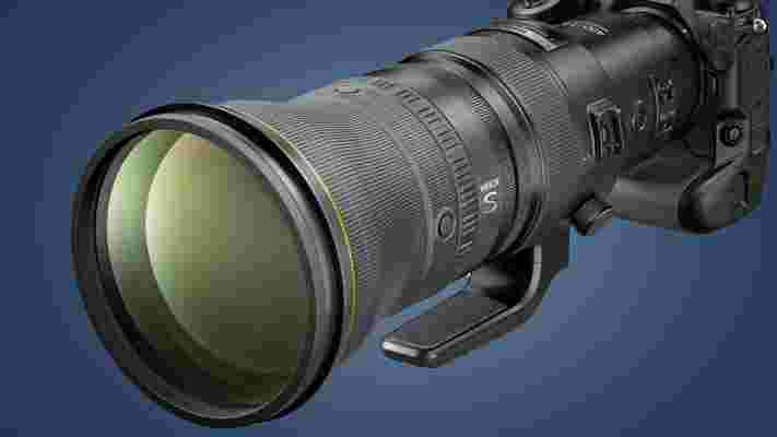
First, it has a built-in 1.4x teleconverter – this means that, rather than having to add your own and increase the size of your setup further, you can push its focal length up to 560mm (albeit with a narrower resulting aperture of f/4). It's also compatible with the Nikon Z series' 1.4x and 2x teleconverters, which means you can get even more reach for subjects on the distant horizon.
Elsewhere, there's a 'voice coil' autofocus motor system, which Nikon has got slightly carried away with and dubbed Silky Swift Voice Coil Motor (VCM). This uses magnets rather than gears to move the lens elements, with the benefit apparently being silent operation – which is particularly handy for wildlife snapping. The slight downside of this system is that it's so powerful that Nikon has advised against using it if you have "a pacemaker or another fitted heart medical device".
Nikon says the Z 400mm f/2.8 TC VR S is also the first Z lens to use its new 'Meso Amorphous Coat', which apparently offers its best-ever anti-reflection performance. We'll have to wait to test that ourselves, but the promised 5.5-stop vibration reduction (which you also get when shooting with the built-in teleconverter) certainly sounds like it'll be a great combo with the Nikon Z9's in-body stabilization.
Analysis: Best wildlife lens ever?
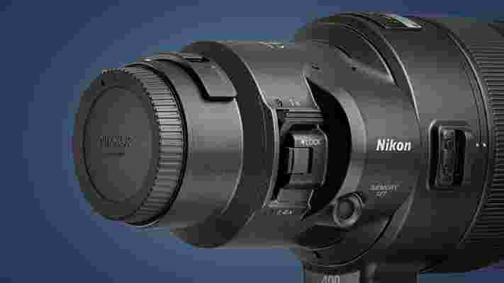
At that $13,999 / £13,499 / AU$22,999 price, which the Nikon Z 400mm f/2.8 TC VR S will be available for in March, this certainly isn't a lens for the average photographer. But it is an interesting example of what the camera giants can do with the latest mirrorless mounts, whose shorter flange distances (the distance between the lens mount and sensor) allow them to make innovative new lens designs.
Nikon's Z-mount is, on paper, the most versatile full-frame lens mount around because it combines the largest diameter mount (55mm) with the shortest flange distance (16mm). This creates a large possible angle of incidence, making it theoretically easier to create very high-performing lenses.
That's exactly what Nikon is doing now, with the Z 400mm f/2.8 TC VR S expected to be followed soon by 600mm and 800mm super-telephoto primes. While it isn't possible to make definitive statements about a lens from official sample photos, the shots below using the combination of a Z 400mm f/2.8 TC VR S and Nikon Z (by photographers Roie Galitz and Matthias Hangst) really do show what's possible with the latest mirrorless camera tech.
You can click on the link below each one to peek at the incredible sharpness, detail, and shallow depth-of-field that's possible with the full-frame super-telephoto, with the resulting compression completely obliterating the background to bring your eye to the subject. We're very much looking forward to testing the Z 400mm f/2.8 TC VR S with the Nikon Z9 soon, but for now here are some stunning sample shots.
Sample photos shot on Nikon Z9 with Z 400mm f/2.8 TC VR S lens

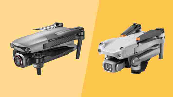
Autel Evo Lite+ vs DJI Air 2S: is Autel's new drone worth the extra?
For a long time, it looked like DJI's affordable consumer drones would fly free from serious competition. But that all changed in September 2021 when Autel announced four upcoming drones that represent serious competition for DJI's successful, entry-level designs.
The Autel Evo Nano and Nano+ are designed to take on the excellent DJI Mini 2 , while the Evo Lite and Lite+ models have landed to take a bite out of the popular DJI Air 2S .
Interestingly, the specification for the Evo Lite series looks like it was taken directly from an existing Air 2S owner’s wishlist – in fact, it could be a compilation of things we might well see in the DJI Air 3, if and when DJI releases that drone.
The Autel Evo Lite+ was designed to exceed or match the DJI Air 2S across the board, sporting almost everything in the existing DJI Air 2S, but with some features that go beyond that design and even compete with the Mavic 3 .
But before we compare the drones and delve into the specifications, let’s start with the inevitable abuse that owning a Lite+ will unleash on your bank account.
Autel Evo Lite+ vs DJI Air 2S: Price
With components in short supply and the cost of chip fabrication rising, the Lite+ was always going to top the Air 2S on price. But it's possible that the Air 2S' price could also rise, and the Air 3 will almost certainly cost more when it does appear.
At the time of writing, the Lite+ costs $1,349 / £1,129 / AU $2,499 for its standard package with a single battery and a single set of replacement blades. For the Premium bundle, with three batteries, lots of props, a three-battery charger, soft bag, and a few other goodies, that outlay increases to $1,649 / £1,399 / AU $2,999 .
That compares unfavorably with the DJI Air 2S, with that drone costing $999 / £899 / / AU $1699 and its Fly More Combo with the extra batteries setting you back $1,299 / £1,169 / AU $2,099.
Overall, the Autel Evo Lite+ costs around $350 / £230 more, irrespective of which bundle you buy. That's a pretty substantial increase of about 30% over the Air 2S, which takes it to a level that's likely beyond the budget of many hobbyist fliers.
Autel Evo Lite+ vs DJI Air 2S: Design
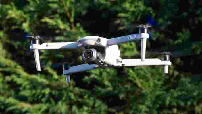
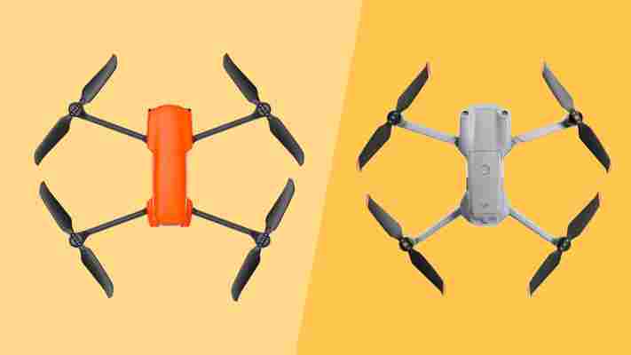
While these drones look remarkably similar in layout and design, the Lite+ is altogether a larger drone that measures 210×123×95mm when folded and 427×384×95mm when the arms are deployed. By contrast, the DJI Air 2S is just 180×97×77 mm folded and 183×253×77 mm when unfolded. This scale makes the Lite+ marginally bigger than even the DJI Mavic 3.
As both of these drones are above the 250g threshold, it might not matter by exactly how much, but the take-off weight of the Air 2S is only 595g, whereas the Lite+ is significantly heavier at 835g.
That might immediately look like a win for the Air 2S until you realise that the extra weight in the Lite+ is allocated chiefly to a larger battery, enabling a longer flight time of 40 mins over 32 mins on the DJI drone and superior wind speed resistance. It can also climb much more rapidly, reaching the legal height limit of 400ft in just 15 seconds.
Both drones have obstacle avoidance, an FFC transmission range of 12km and the ability to record up 5.4K resolution video up to 30 fps. But what truly divides these drones is the camera technology, as the Autel Evo Lite+ has a much more modern sensor, optics and image processing technology.
The Lite+ comes in three colors, including the signature Autel Orange, compared to the single grey color scheme that DJI has on the Air 2S.
Autel Evo Lite+ vs DJI Air 2S: Cameras
Sensor size is all about collecting as much light as possible to produce the best representation when stills or video are captured. Both drones have a 20MP 1-inch CMOS sensor with 2.4μm pixel size, but the Air 2S has a fixed f/2.8 aperture.
One feature that the DJI Mavic 2 Pro offered that's missing on the DJI Air 2S was a camera with a variable aperture. This is something that's offered by the Evo Lite+, with its aperture adjustable from f/2.8 to f11.
This allows much greater management of the light that's entering the camera, without the need for ND filters – and even greater scope if ND filters are used.
The camera field of view on both drones is pretty similar, at 88 degrees on the Air 2S and 82 degrees on the Lite+.
But the Lite+ sensor also has many other enhancements that enable it to capture relatively noise-free content in even very low light conditions. Whereas the video ISO for both drones is capped at ISO 6400 for standard scenes, a special night mode on the Lite+ allows the ISO to increase to an incredible ISO 48000. This gives the Lite+ the edge when shooting in low-light conditions, and it's also better able to capture realistic colors in those situations.
Where the Air 2S has an advantage is that it can capture content in a D-Log format that provides plenty of scope for adjustment in post-processing – this is something that Autel has promised in a future firmware release for the Lite+, but it isn’t available yet.
Autel Evo Lite+ vs DJI Air 2S: Video modes
While the Lite+ has ‘6K’ emblazoned on its camera, it offers an almost identical maximum resolution and modes as the Air 2S. The best resolution of the Lite+ is 5472x3076, whereas the Air 2S has two extra vertical pixel lines at 5472×3078.
At that resolution, both offer 30fps, and they can increase this to 60fps by trading down to 4K, and up to 120fps by going down to 1080p.
The maximum bitrate on offer is 150Mbps on the Air 2S and 120Mbps on the Lite+. This means there's slightly less compression on the DJI drone's video, though not enough to make a dramatic difference in quality.
Autel has promised HDR modes for 4K and lower resolution video in a future update, and that is something that DJI doesn’t offer or, at the time of writing, intends to add.
Both drones support H.264/MPEG-4 AVC and H.265/HEVC encoding, but the Lite+ has only 8-bit color representation where the Air 2S has the option to shoot 10-bit Dlog-M.
The biggest difference between these two cameras becomes evident at night, as the Air 2S has a maximum ISO of 6400 in manual video capture and only 1600 if you use Dlog-M.
For automatic video and still image capture, the Lite+ can match the Air 2S' ISO 6400 option, but using the Night scene mode boosts that sensitivity to ISO 48000. It also has special a moonlight processing mode to reduce noise impact when recording at these very high ISO levels.
Still images on the Lite+ can be shot in 10-bit DNG, showing the sensor can work with the extended contrast of this bit depth, and the maximum resolution is 5472x3648, identical to that of the Air 2S.
Overall, the Lite+ is a good representation of how camera technology has evolved since the Air 2S was launched, and its video quality is closer to that of the Mavic 3.
Autel Evo Lite+ vs DJI Air 2S: Performance
While the top speed of both drones is a similar 19m/s, the Air 2S has a quoted wind resistance of 10.7 m/s compared to the 16.5 m/s that the Lite+ can allegedly handle.
That performance level exceeds the 12 m/s of the Mavic 3 and hints at just how much power the Lite+ can call on when required. This raw grunt is apparent in ascent speeds, where it can rise at 8 m/s, a full 2 m/s faster than the Air 2S.
The flipside of this feature is that, being heavier, Autel prefers to avoid momentum taking control in rapid descents, and the Lite+ only comes down at 4 m/s, 2 m/s less than the Air 2S.
Overall, the Lite+ is better for getting up to altitude rapidly, but the Air 2S has a slight edge if you need to get the drone back on the ground quickly.
One good reason you might want to do that is a low battery, and with only a maximum of 3750mAh on the Air 2S and a flight time of just 31 minutes, that’s a plausible scenario.
The Lite+ has a relatively massive 6175mAh battery, and even though it carries an extra 240g (about the same as strapping a DJI Mini 2 to the Air 2S), it can remain airborne for an impressive 40 minutes.
Many DJI Air 2S pilots would be thinking about recovery at around the 25-minute mark, but the Autel drone flyer has at least another ten minutes of operational time ahead. That’s plenty of extra time to take another go at achieving that unique shot or trying something new.
The differences between DJI’s Ocusync 3.0 and Autel’s SkyLink transmission technology are subtle. For the majority who operate within the visual range limits imposed by most countries, they won’t experience disconnections even where there are interfering signals.
Technically, Skylink is rated for 12km FCC and 6km CE, whereas Ocusync 3.0 is 12km FCC and 8km CE. Flying in a CE environment, we didn’t notice any dramatic disadvantage for the Autel drone.
What we can confirm is that Skylink is far superior to Ocusync 2.0 as seen on the DJI Mini 2 and original DJI Mavic Air 2. It's very easy to fly out to the 500m limit, even in a cluttered location and behind buildings, without ever losing the video feed or control.
One aspect of the Autel drone that we liked was that the transmission technology provides a 2.7K resolution live video stream back to the Sky app when the drone is within 1km, whereas all the DJI drones can only manage 1080p at best. The clarity of this image makes the Lite+ easier to work with when operating around tree branches and wires that the obstacle avoidance might not detect.
Autel Evo Lite+ vs DJI Air 2S: Obstacle avoidance and GPS
The obstacle avoidance system on these drones is very similar, offering forward, rear and below sensors, but lacking lateral vision. The Air 2S also has additional upward-looking sensors, making it suitable for those who like to fly under structures such as bridges.
While it isn’t comparable, the forward sensors of the Lite+ have a greater vertical angle than those on the Air 2S, enabling it to see things above it to a degree. Still, neither of these drones have the level of avoidance we’ve seen on the Skydio 2, but it might avoid an expensive accident, especially for those new to the hobby.
In both, obstacle avoidance is disabled in 'sport' mode automatically, and it won’t work in low light conditions. For night landings, both have an LED that illuminates the ground below the drone to help downward-looking sensors see during this flight phase.
Currently, the Lite+ employs a system that inhibits the user from flying into obstacles that the drone senses, though it won’t autonomously fly around them, whereas the Air 2S has the option to self-navigate in a limited way. We believe Autel intends to add this functionality, most likely when it delivers dynamic tracking to the Lite+ shortly.
For geographic location accuracy, the Lite+ can call on GPS, GLONASS and Galileo, the same technologies that the Air 2S uses. One extra feature on the Air 2S that isn't available on the Lite+ is AirSense, a technology to detect other aircraft and helicopters while flying.
Autel Evo Lite+ vs DJI Air 2S: Early verdict
Like the recent DJI Mavic 3, the Autel Evo Lite+ has come to market with a few features still to be added, but fewer than the Mavic 3 had missing before its recent firmware update.
By comparison, the DJI Mavic Air 2 has been around for much longer, having first appeared in April 2020, before being updated to the DJI Air 2S a year later. This means the Air 2S is a more mature piece of technology with all its functionality complete.
DJI recently released an SDK for the Air 2S, enabling third-party applications like Litchi and Rainbow to operate the drone. Autel is also looking into providing an SDK, and we hope it provides one for the Lite+ at some point.
That said, the Lite+ has an attractive performance envelope already, and it will only get better as Autel delivers new firmware releases. A fantastic camera with enhanced low light capabilities and a variable aperture lens makes it ideal for those who take drone cinematography seriously.
When the extended flying time of the Lite+ is factored in, DJI now has some serious competition in the prosumer slice of the camera drone market. After Autel has added a flat profile shooting mode and 4K HDR capture, the Evo Lite+ could become the go-to solution for those unwilling to embrace the eye-watering cost of the DJI Mavic 3.
However, the Lite+ does cost a significant amount more than the Air 2S, and for those with a limited budget, that drone is still a great performer.
Amazon Echo Show 15 vs Amazon Echo Show 10: which smart display should you choose?
The best smart display changes the way you interact with a voice assistant - it allows you to see, as well as hear, the information being served. Amazon was the first brand to launch one of these smart speakers with a built-in screen back in 2017, with the original Echo Show boasting a 10.1-inch display.
Since then, Amazon has expanded the Echo Show range with new iterations of the 10.1in form factor, the most recent of which is the Echo Show 10 .
It has also launched several smaller smart displays, such as the Echo Show 5 (2nd gen) and the Echo Show 8 (2nd gen ). However, it’s never attempted to launch a bigger smart display...until now.
The Echo Show 15 went on sale in late 2021, and in a departure from previous Echo Show smart displays, the Show 15 is designed to be wall-mounted. It can be used as a freestanding unit, but requires a stand that comes at extra expense.
Given that the two smart displays have the same price tag of $249 / £239.99 / AU$399, is bigger really better? We pitted the Echo Show 15 against the Echo Show 10 to find out, so you can confidently choose the smart display that suits you.

Best Amazon Echo Show 15 and Amazon Echo Show 10 deals
Read on to find out just how these smart displays compare – or, if you know which Alexa smart speaker and screen in one you want, check out the best prices right now for both products below:
Price
The Amazon Echo Show 15 and the Amazon Echo Show 10 will both set you back $249 / £239.99 / AU$399 - making them the most expensive smart displays the brand offers.
The Echo Show 10 is available worldwide, but while the Echo Show 15 is currently on sale in the US and the UK, in Australia it’s still being billed as ‘coming soon’, and Amazon was unable to confirm to us the exact date it will be made available for purchase.
As we’ve already mentioned, while the Echo Show 10 is freestanding, the Echo Show 15 is designed to be wall-mounted. An optional stand is available so it can be used on a surface or side, but this is priced at $29.99 / £29.99 / AU$49.99 , making the Echo Show 15 slightly costlier if you don’t want it freestanding, or you live outside without any walls.
When it comes to rival smart displays, the Google Nest Hub Max , which also has a 10-inch screen, is slightly more affordably priced at $229 / £219 / $349 . However, Google doesn’t offer any bigger smart displays that rival the Echo Show 15.

Design
The screen sizes aren’t the only thing that differs between the Amazon Echo Show 15 and the Echo Show 10 - they actually look dramatically different. The Amazon Echo Show 15 is a rectangular smart display that can be used in either portrait or landscape mode.
In a style similar to a picture frame, the Show 15 has a thick black bezel, while the 1980 x 1080 15.6-inch display is positioned in the center of a white surround, with the camera lens located in the top right-hand corner of the screen (if it's used in Portrait mode).
As we’ve mentioned already, the Show 15 is designed to be wall-mounted but an optional stand is also available so it can be placed on a countertop for example.
The Show 10, meanwhile, is a freestanding smart display, with a cylindrical base wrapped in grey mesh fabric. The 10.1-inch screen, which has a resolution of 1280 x 800 is positioned on top of the base and can be titled to ensure it's at the best angle for you to see no matter where it's placed.
Given the large screen size, it's no surprise that the Amazon Echo Show 15 has a bigger footprint too, measuring 15.8 x 9.9 x 1.4 inches (w x h x d) compared to the Echo Show 10 which at 9.9 x 9 x 6.7 inches is more compact.
Both devices are mains-powered and when it comes to sound, the Echo Show 10 has two one-inch tweeters and a three-inch woofer, all of which are contained in the cylindrical base.
The Echo Show 15 doesn’t quite have the same audio capability and relies on two 1.6 inch speakers, which can be found in the back of the smart display.
The pair also differ when it comes to their built-in cameras too. The Echo Show 10 has a 13MP camera that will automatically pan and zoom, and the screen also rotates to ensure you’re always in the center of the frame during video calls, even when moving about the room.
The Show 15 doesn’t offer the same camera-tracking capability - the sensor is lower quality at 5MP and doesn't offer the same pan and zoom functionality.
However, both smart displays offer a privacy shutter that cuts the power to the microphone, while covering the camera lens for those that want the peace of mind that their every move isn’t being watched.

Features
When it comes to the most basic tasks you’d use a smart display for, the pair are evenly matched.
Alexa is built into both, obviously, and on the test we had the same responses to the questions we posed to the voice assistant, although the Show 15 has Amazon’s latest processor - dubbed the AZ2 Neural Edge, which can recognize voices better meant. This meant we found requests were picked up a second or two faster than when using the Echo Show 10.
On test, the Show 15 also didn’t pick up nearly as many false activations (when Alexa starts listening without you saying the wake word) as the Echo Show 10.
Both smart displays also offer a visual interpretation on screen of any responses Alexa provides to your queries, as well as offering the ability to listen to music streaming services including Spotify and Prime Music or watch Netflix and Prime Video on the screen.
However, while the Echo Show 15 screen is higher resolution, which results in a sharper picture than on the Echo Show 10, neither is good enough to replace your TV for entertainment.
The Echo Show 15 is the only one of the two smart displays to offer widgets. These small blocks of information such as upcoming appointments, an update on how long your commute is for the day, a TV show you’re watching or even a to-do list for everyone in the household, can be added to the screen so they can be viewed at a glance. There are around 12 widgets available at present, although more are expected in the future.
However, we found that you weren’t able to adjust the size of the widgets, which meant, as they vary in size, some were not always immediately visible.
Widgets ensure the Echo Show 15 can double as a family hub - or digital pinboard that allows everyone in the household to see digital sticky notes, to-do lists or other information, at a glance.
As we’ve already mentioned, the Echo Show 10 is only one of the pair that has a moving screen. As you move around the room, it will follow you so it’s always within your gaze, so whether you’re following a recipe when cooking in the kitchen or staying in touch with friends and family by video call, the screen will never be out of your sight.
Verdict
When it comes to choosing between the Amazon Echo Show 15 and the Echo Show 10, as both smart displays perform the most basic tasks equally and cost the same, it really comes down to how you plan to use it as to which you should opt for.
For those that want a smart display that offers the biggest screen possible or can be wall-mounted, the Echo Show 15 is the best choice. It’s also the better option for those that want a family hub, offering a way for everyone in the home to see important information such as the chores for the day, shopping lists, or even reminders about after-school clubs, parties, and other appointments.
However, for those that want a freestanding smart display for a countertop or other surface, or prefer a smaller device, the Echo Show 10 is the one to choose. This smart display is also ideal if you plan to make a lot of video calls on the device or use it in the kitchen to follow along with recipes, as the rotating screen will ensure it’s always in your eye line even when you move around.
Whichever Amazon smart display you plump for, it’ll be sure to make life a little easier, meaning you can see information at a glance rather than relying on sticky notes - whether that’s reminders, recipes or other information.