Brave Software has introduced a very useful new feature to its search engine, called Discussions, that will help surface the results users are really looking for.
"When people search, they want relevant, useful results, free of noise," the company wrote in a blog post . However, advances in the field of SEO have propelled less useful resources up the rankings.
A recent viral post took a look at the issues in more detail, provocatively arguing that Google Search was "dying", because useful answers are becoming harder and harder to find.
The solution, as many people have found, is to add "Reddit" to the end of results, surfacing discussions on the topic that have taken place in a relevant sub-reddit.
The Discussions feature for Brave Search introduces a panel directly into results highlighting any relevant discussions from popular online forums, including Reddit.
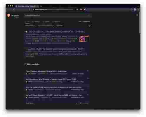
Brave says Discussions are especially useful for several specific types of searches: product questions, questions about current events, travel-related questions, computer programming / coding questions, and highly unique or specific questions.
Search wars
Google is, in many ways, the best internet service ever to exist: cataloguing the entire web and helping people search for pretty much anything was such a massive breakthrough.
But whether the dominance of Google has been healthy for the search market is another question. In its blog post, Brave argues that the focus on Google rankings among businesses has had a particularly detrimental impact.
"Unfortunately, search engine optimization has become such a science - and a big business - that results pages in Big Tech search engines like Google are often cluttered with ads and automated content (or “SEO spam”) from marketers trying to game the system and increase the rank of their sites," wrote the firm.
While Brave occupies a tiny share of the search market, it's interesting to see pressure applied to Google and perhaps there's a team at the search giant working on a Discussions-esque feature, too.
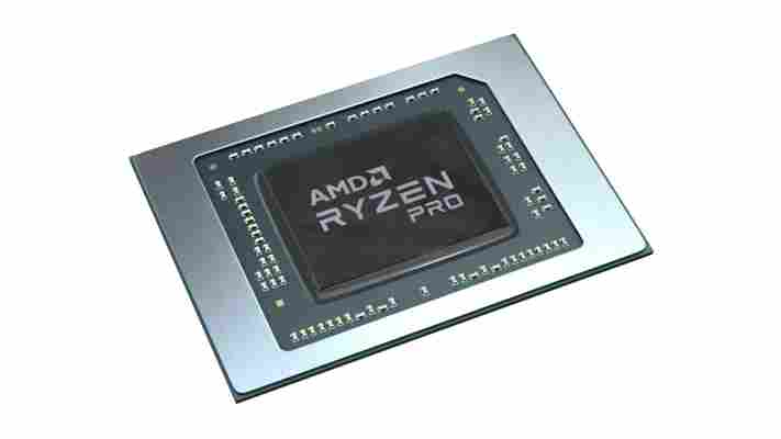
AMD’s new Ryzen Pro 6000 CPUs apparently crush Intel in an all-important contest
AMD has launched a new series of processors designed to underpin the fastest and most energy-efficient mobile workstations on the market.
Announced at CES 2022, the Ryzen Pro 6000 series is made up of eight distinct SKUs, topped and tailed by the eight-core Ryzen 9 Pro 69050H and six-core Ryzen 5 Pro 6650U, respectively.
The launch of the new range marks the first time AMD’s Zen 3+ architecture features in a CPU for business laptops , bringing with it support for the latest DDR5 memory and Wi-Fi 6E networking technologies.
Battery is king
During a presentation attended by TechRadar Pro , AMD laid out the performance gains achieved by its new Ryzen Pro 6000 CPUs. As ever, the specific comparisons were carefully selected, but nonetheless offered some indication as to what we can expect.
In comparison to Intel's 12th Gen Core-i7 chips, the new Ryzen processors are said to offer up to 17% performance uplift across common collaboration and video conferencing workloads, and up to 15% greater performance for office software .
The attribute AMD is most eager to shout about is battery life, however, which has become all the more important since the transition to a hybrid working model.
“IT decision-makers and professionals have different expectations for their business laptops than they did two years ago. Today, employees want the best experience, all-day battery life and cutting-edge connectivity,” said Matt Unangst, who heads up the commercial client business at AMD.
“AMD is uniquely positioned to help laptop OEMs meet professionals where their expectations are, and we are laser focused on delivering leadership solutions.”
The company says its Zen 3+ architecture offers an unrivalled power-to-efficiency ratio, with up to 45% longer battery life for video conferencing over Microsoft Teams in comparison to Intel’s Core i7-1260P. And overall, AMD claims customers can expect well over 24 hours’ worth of battery life from the new range.
Laptops powered by the Ryzen Pro 6000 series - including the new ThinkPad Z from Lenovo and HP Elitebook G9 – are expected to hit the market later this quarter.
Google Chrome 100 update arrives with a new icon - and that's all we need
Google Chrome has been updated to version 100 , bringing with it bug fixes, the removal of lite mode, and most of all, a new icon.
In the 14 years since the web browser was released, Chrome has become an app that many use for anything else other than browsing the web. Partly thanks to the Chrome Web Store , you can play games, complete your school report and watch Moon Knight all without checking a web page.
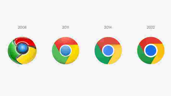
Google has made a fun look back on 100 web moments since 2008's arrival of Chrome, but while this is a fun read, the more pressing matter is the new icon that version 100 brings.
It made me want to look back on another logo change from Instagram , and how its change in 2013 was so major.
An iconic icon
Logos need to match the style of the time, and one example was when iOS 7 arrived in 2013. The design changed from skeuomorphism, which is a way of reflecting real-world objects, to a flat design that you use today on your Apple device.
This meant that the majority of apps had to change to fit this style, otherwise they would stick out sorely. The most prevalent for me was Instagram, which could have changed its logo from a camera to something that reflected part of the camera in a flat design. But instead, there was a change that set it apart from the other social platform apps at the time.
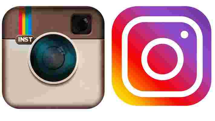
While the revamped logo reflects a camera, the colors were striking at the time, and still are today. When Instagram was celebrating its birthday in 2020, it added an easter egg to its app to bring back the classic icon.
Oddly, the old icon fit in the world of iOS 14 , so it was a shame to see it go in quick succession soon after.
But Google's efforts with Chrome's icon have been progressive. From something that looked like an evil Pokéball in 2008, to one that looks pseudo 3D for version 100.
While its other icons have brought controversy, such as using the same color schemes for its other apps in 2021, Chrome has been consistent, almost being the template for these apps.
But as tastes and trends change in technology, we may see a cross between skeuomorphism and flat design converge, with another major icon change by the end of this decade. And for me, I'm all for it.